Let the AI build it. Do not let it design it.
Swivl's AI Website Builder makes websites for plumbers, electricians and other home-service businesses. I designed the building blocks it uses, so every site it makes looks good from the start.
Every section comes in four versions, each for a different kind of business.
Some businesses have great photos, some have none. Some offer two services, some offer eight. Each version is made for one of those cases. All ten sections are below, for web and mobile.
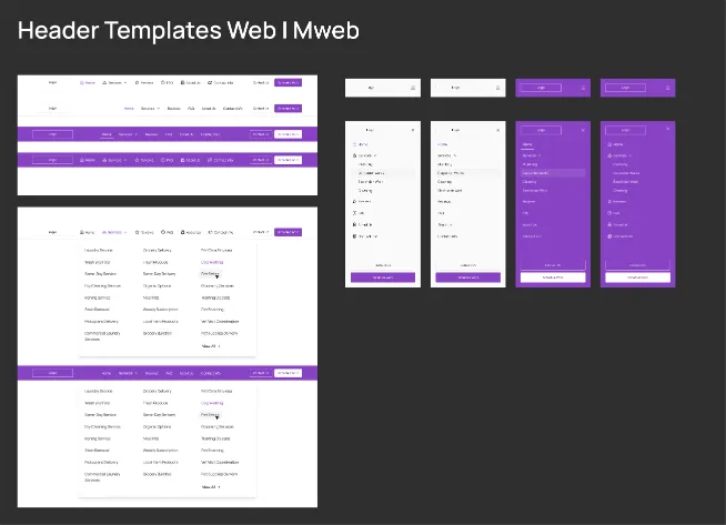
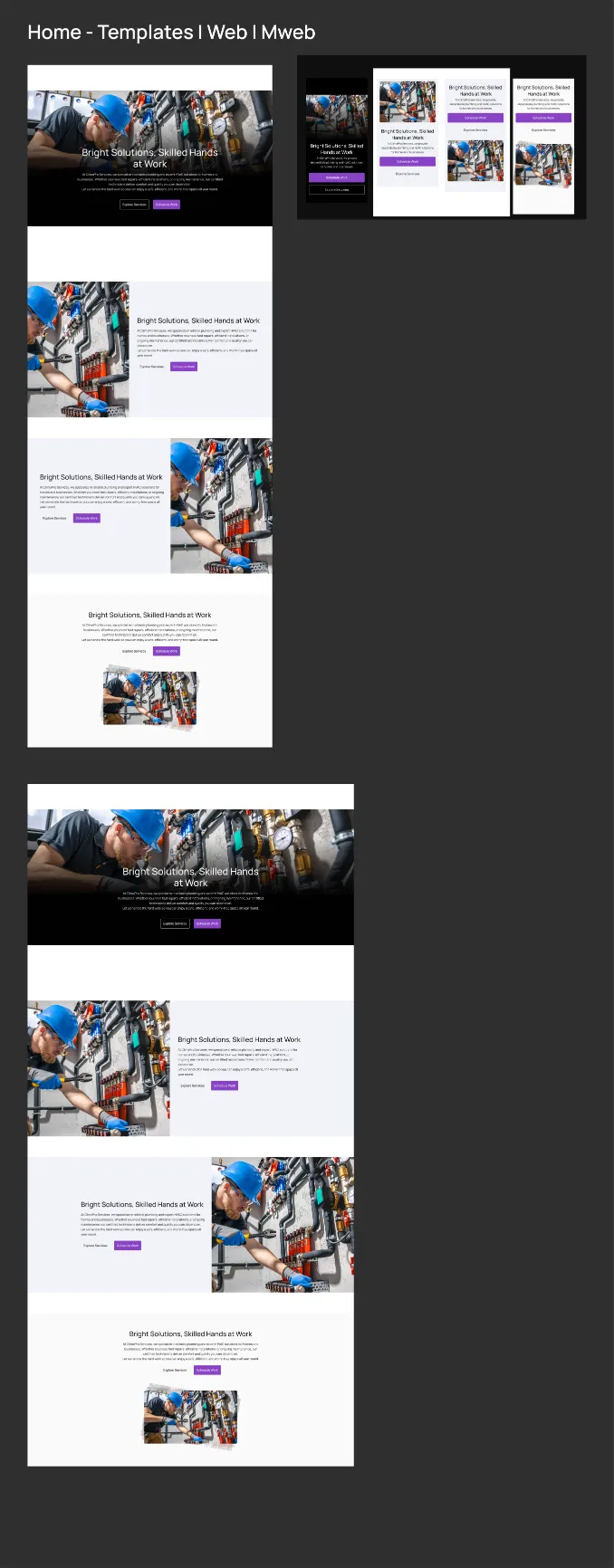
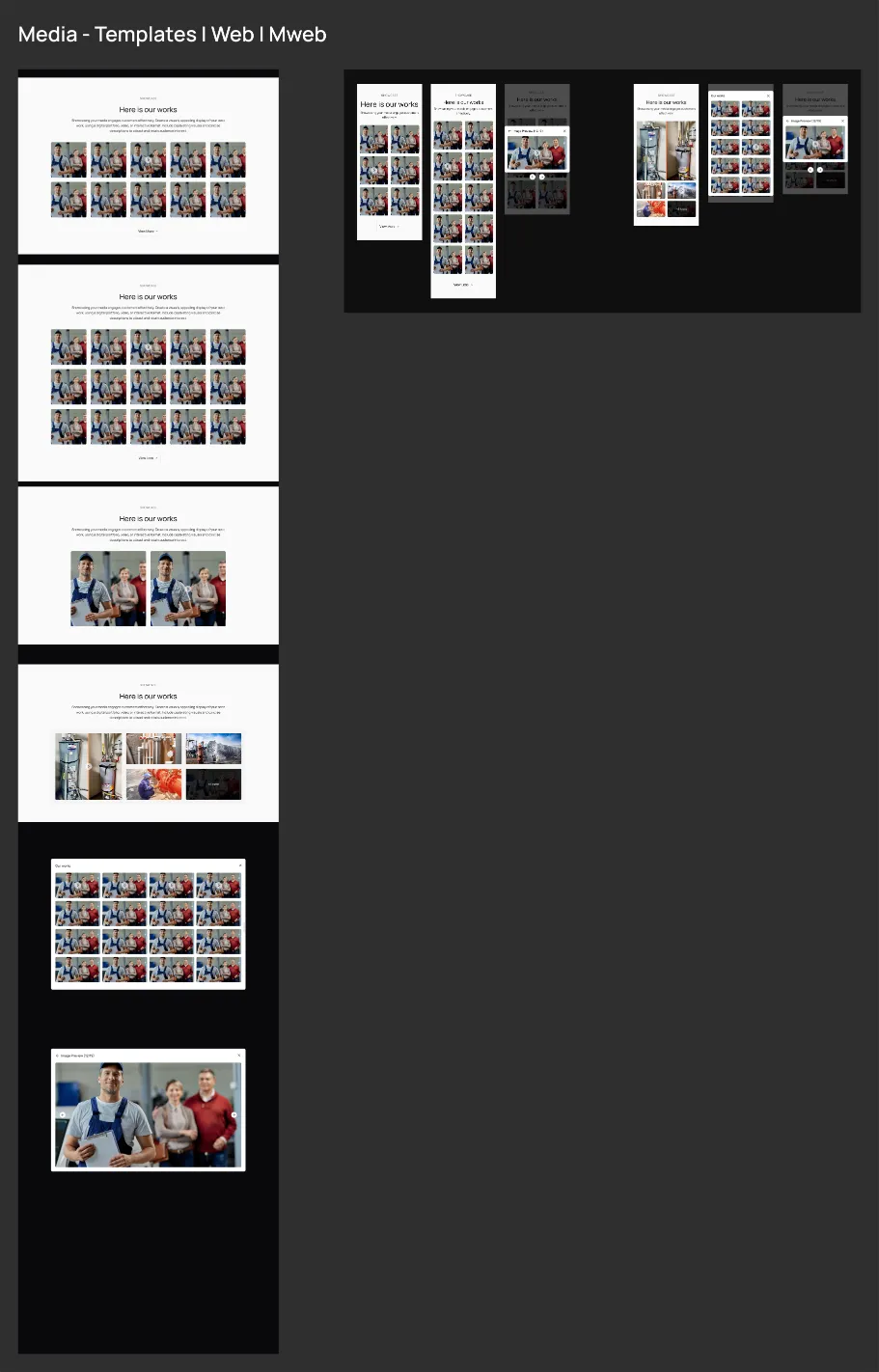
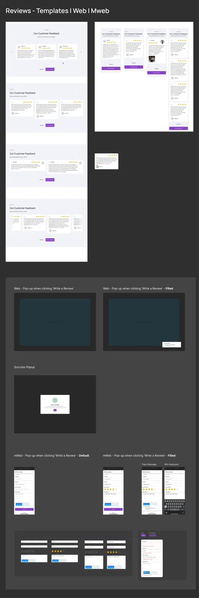
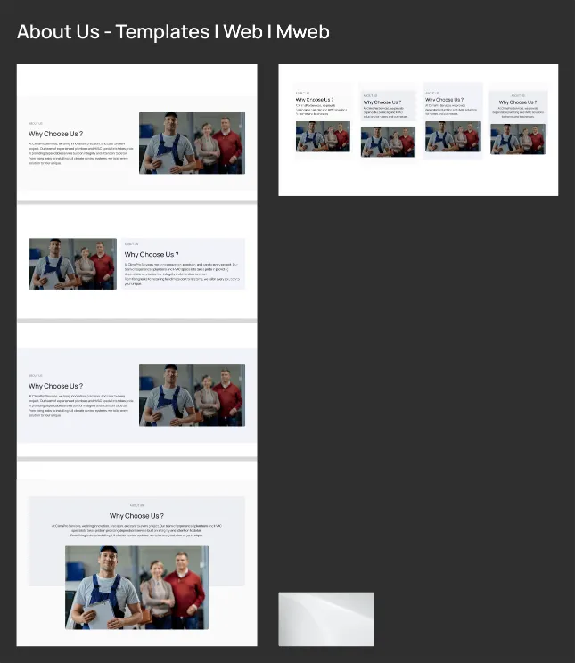
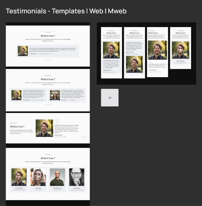
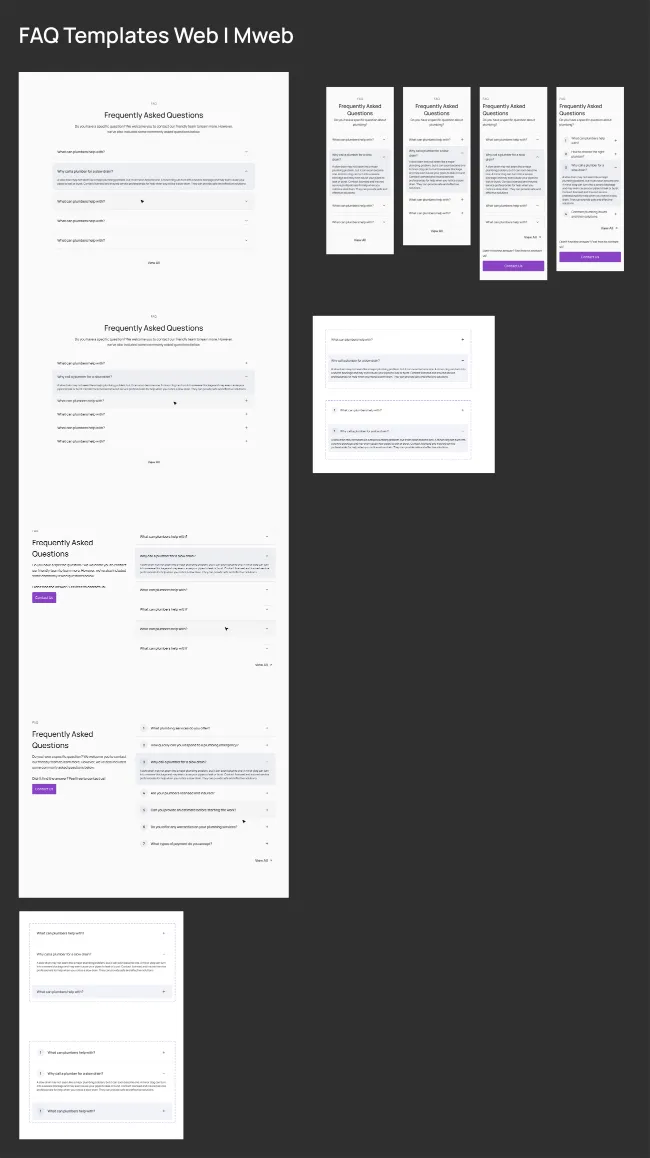
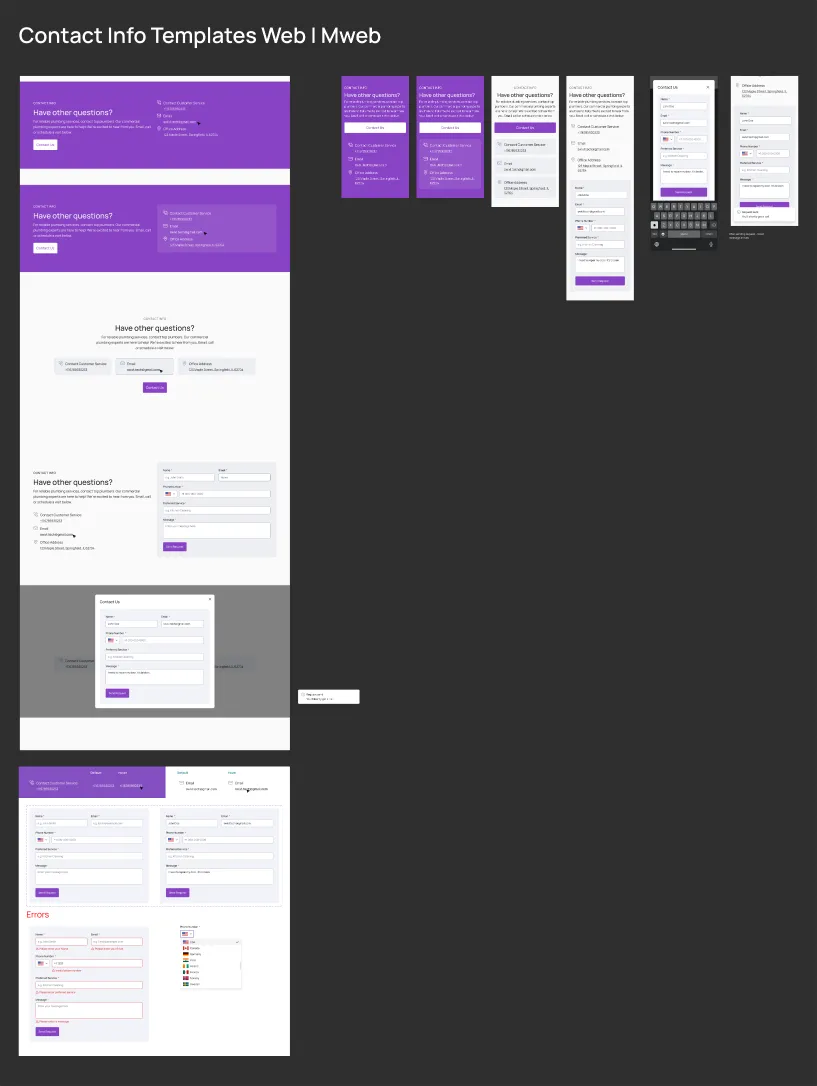
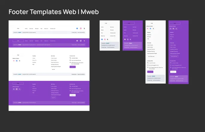
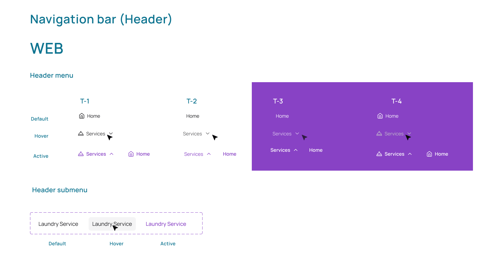
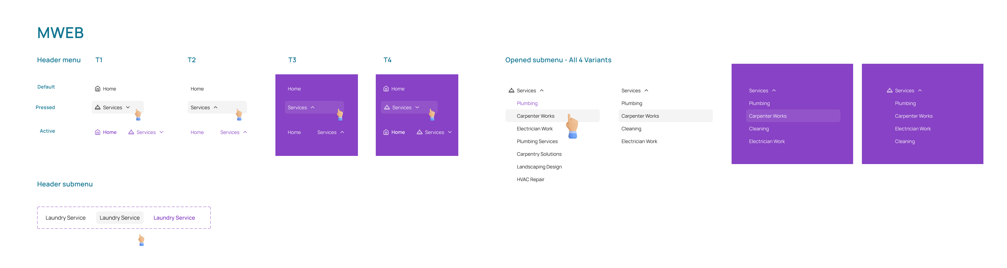
A full page is just ten picks, one for each section.
I built a complete sample page to prove the pieces fit together on phone, laptop and large screens. Nothing custom - just ten choices from the library, stacked.
different pages, from 10 sections, 38 layouts and 6 colour themes.
The layout of every one is already approved, because each section
is always one of the 38 layouts I drew and checked.
That is the whole idea. Each new layout adds many more pages, but only one more thing to check.
- Phone
- 360 px
- Laptop
- 1440 px
- Large screen
- 1920 px
I rebuilt the full page at 1920 px instead of assuming it would stretch. Wide screens are where hero sections usually break.
Templates break as soon as real content goes in.
A plumber has job photos and no idea what a grid is. Most templates expect six services and professional photos. Add only three services and there is a gap. Use a dark photo and the headline disappears.
I didn't design one website. I designed a set of pieces the AI can put together in any order, and checked that every mix still looks right.
If you let the AI design freely, it breaks in a new way every time and nothing catches it. So the rest of this page is about three things: what can change, what stays fixed, and where the AI gets a say.
The AI writes the content. It never touches the layout.
I designed the layout, spacing, type and colours, and locked them. The AI only fills in words and images, in spaces already made for them.
What the AI does
- Writes headlines and text, with Generate
- Rewrites existing text, with Improvise
- Suggests different images
The same two buttons sit on every text field, so people only learn them once.
What stays locked
- Which layouts exist, and how each one is built
- Page width, margins and columns
- Font sizes and spacing
- Colours and text contrast
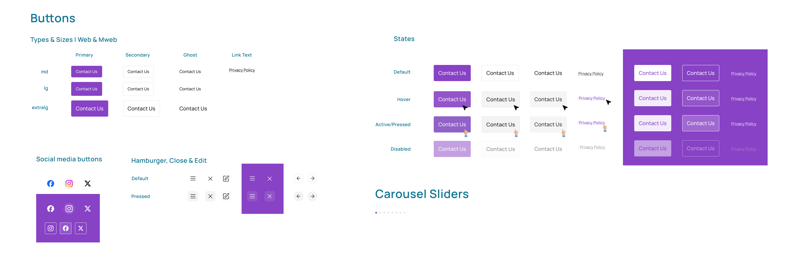
- Every hover, pressed and disabled state
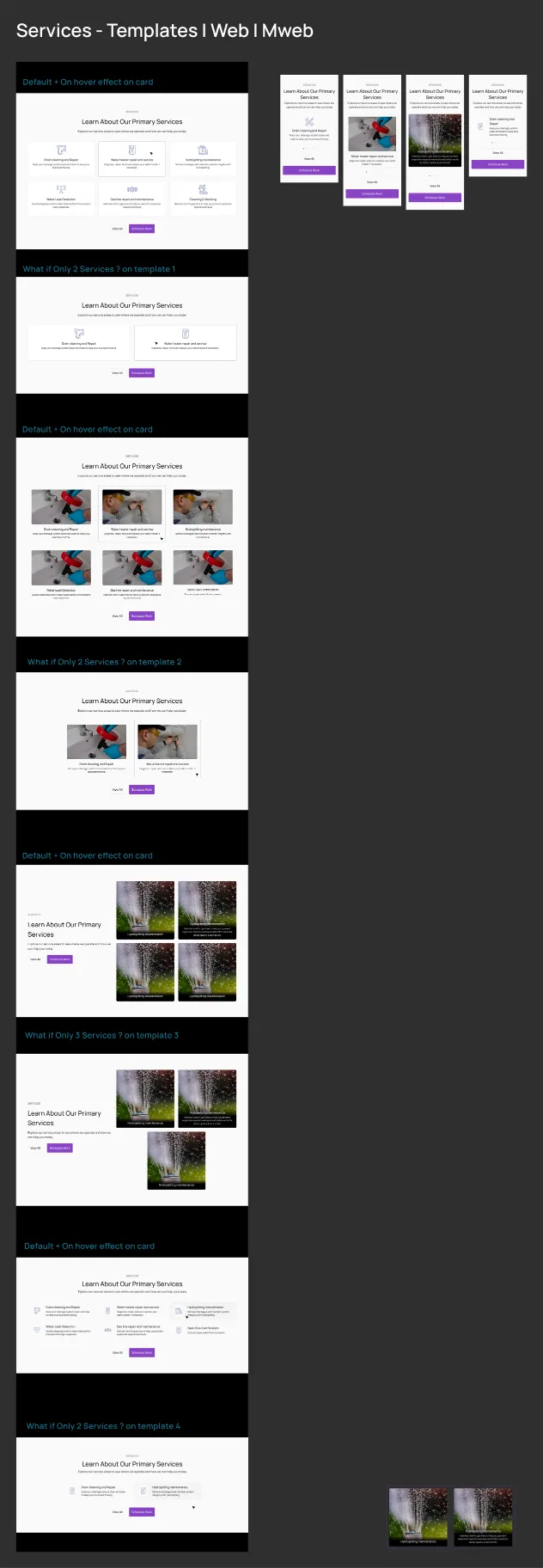
The real test is a business with only two or three services.
Six services are easy to lay out. Three is the hard one. So every template has a version for fewer items, and it still looks planned.
Six services
The easy case every template is designed for: two rows of three.
3 per row · 416 px cards
Three services
Two on top, one centred below. This is the case that shows whether the templates feel finished.
2 per row · third one centred
Two services
Two side by side. A small business still gets a page that looks planned, not half-empty.
2 per row · 636 px cards
Colour themes change the look, but never break the layout.
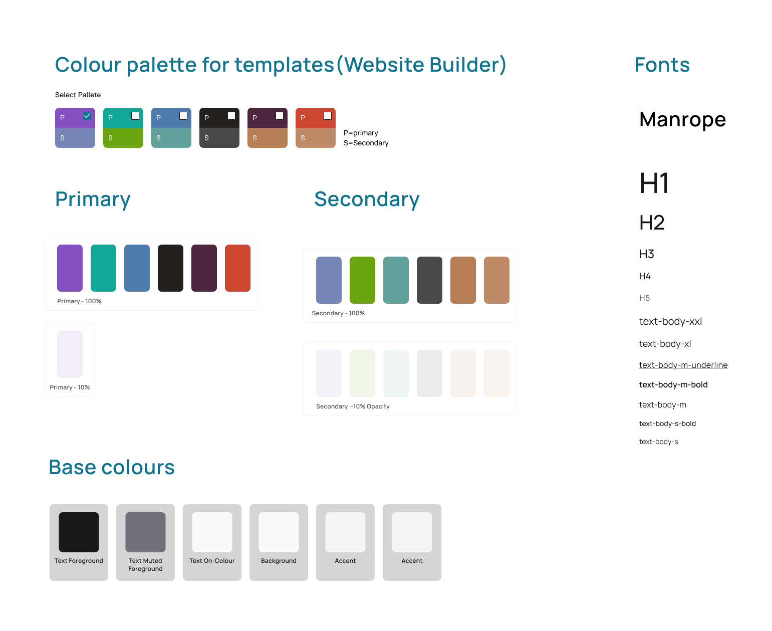
There are six colour themes over one page design. A theme changes only four things. Everything else stays fixed, so no theme can break a page.
- Button colours
- The big call-to-action band above the footer
- One light background tint
- Link colour and the logo
- Layout, grid and section order
- Background, card, border and text colours
- Fonts, spacing and corner shapes
- Star ratings and status colours
Owners edit their site using the same sections I designed.
There is no prompt box. Each section has its own simple panel. A section can be a block on the page, a menu item, or a page of its own. Learn it once, use it three ways.
-
01
AI help sits on each field
Generate and Improvise appear only on text and image fields, so people always know what the AI is about to change.
-
02
Switch sections on or off, drag to reorder
The header and footer share one menu, so turning a section off removes it from both.
-
03
Each service has a short and a long description
The short one, up to 100 characters, goes on the card. The long one goes on the service's own page.
-
04
Buttons link to sections, not web addresses
You pick a section or page from a list instead of typing a link, so a button can never lead nowhere.
Booking turns the website into a way to get jobs.
A plumber needs jobs, not just a website. Booking is a three-step form you can open from the menu, the top of the page or any service. It collects everything the job needs, even photos of the problem.
Pick a time
1/3Choose a day, then a time - morning, afternoon, evening or night, in half-hour slots.
Contact details
2/3Name, email, phone and address. The time you picked stays on screen, and you can change it.
Job details
3/3Describe the problem and add photos, videos or files, so the plumber can give a price before driving over.
Each finished step shows up as a small chip on the next one. You can fix the time on step three without starting over - a common reason people give up on long forms.
Designed for when things don't go to plan
- The calendar open, and “Select Today” pressed
- The phone form with the keyboard open
- An “Are you sure you want to close?” check, on web and mobile
- A success screen that repeats the booking back
I check my own work with a checklist before handoff.
24 checks in five areas, done before the design goes to engineering. Handoffs go wrong in the same ways every time, and a checklist is cheaper than fixing things later.
Happy and unhappy paths, ways in and out, edge cases, knock-on effects, and the problem itself.
Options explored, following the system, icons and brand tone, the grid, and hover and pressed states.
Contrast, tap-target size, keyboard and screen-reader use, and motion.
Linked flows, clear specs, components used properly, named versions, reasons written down, and a tidy file.
Peer and lead review, stakeholder sign-off, a check with developers, and a final walkthrough.
What I would fix in the next version.
Version 2 proved the idea works. Version 3 should let it grow without a designer redoing things by hand.
-
Turn colour themes into settings
Today the six themes are six recoloured copies of one page. They should be one set of colour settings, so a seventh theme is quick to add - and the AI can match a brand it has never seen.
-
Fix text contrast for each theme
One rule puts white text on every main colour. On at least two themes, small labels end up hard to read. Each theme needs its own text colour.
-
Design the missing states
Hover, pressed and disabled are done. Keyboard focus, loading, empty and error are not - and a live site needs them. An empty gallery is a real screen.
-
Add a tablet size
The designs jump from 1440 px to 360 px. For a product that promises sites that work on every screen, tablets can't be left to guesswork.